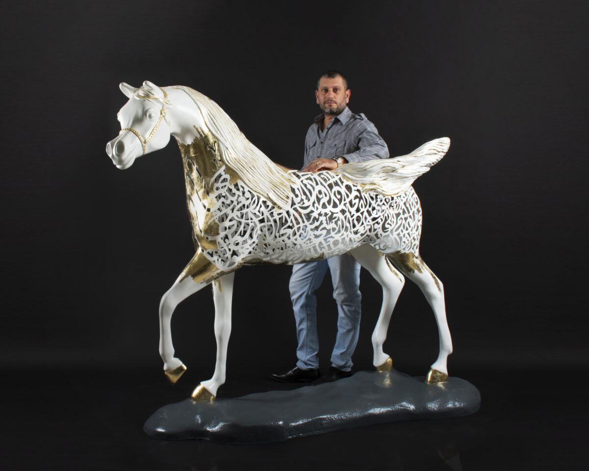
 The Horse
[smartslider3 slider="3"]
Read More
The Horse
[smartslider3 slider="3"]
Read More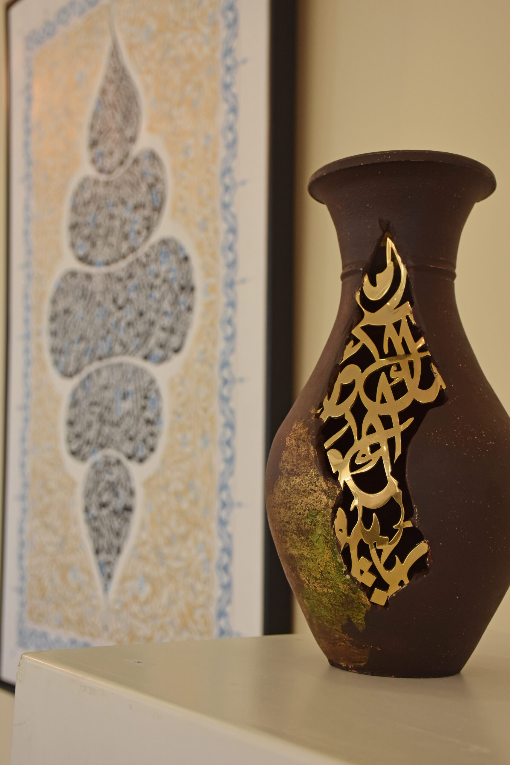 THE POTTERY
[wptb id=401] *The practice of kintsugi is said to have...
Read MoreNovember 9, 2019
![]()
Lorem ipsum dolor sit amet, consectetur adipiscing elit. Praesent tempor lorem sed dui porttitor imperdiet. Praesent vestibulum dictum libero. Sed congue est ac faucibus pulvinar. Nulla nunc arcu, euismod tempor semper vitae, vehicula vitae turpis. Etiam accumsan tincidunt tortor, et lacinia nulla vestibulum quis. Vestibulum massa libero, aliquet sit amet massa non, consectetur varius quam. Proin tempus iaculis leo quis ullamcorper. Cras et rhoncus diam. Sed elit diam, faucibus ultricies fringilla in, dictum malesuada neque. Nullam non nisi dictum, mollis ligula quis, sodales elit. Sed ultrices metus ultricies vulputate molestie. Morbi bibendum magna in lacus mattis, id dapibus turpis egestas.Lorem ipsum dolor sit amet, consectetur adipiscing elit. Praesent tempor lorem sed dui porttitor imperdiet. Praesent vestibulum dictum libero. Sed congue est ac faucibus pulvinar. Nulla nunc arcu, euismod tempor semper vitae, vehicula vitae turpis. Etiam accumsan tincidunt tortor, et lacinia nulla vestibulum quis. Vestibulum massa libero, aliquet sit amet massa non, consectetur varius quam. Proin tempus iaculis leo quis ullamcorper. Cras et rhoncus diam. Sed elit diam, faucibus ultricies fringilla in, dictum malesuada neque. Nullam non nisi dictum, mollis ligula quis, sodales elit. Sed ultrices metus ultricies vulputate molestie. Morbi bibendum magna in lacus mattis, id dapibus turpis egestas.
Adapting the Arabic font to the beloved hand-painted Latin version of the Nando’s font, previously done by sign-writer Marks Salimu, was a very exciting process. To kick it off, we enlisted the help of a classical calligrapher and had him write each letter in the five classical Arabic scripts (Naskh, Farisi, Diwani, Thuluth, and Reqa).
|  |
It is important to adapt your brand identity to the culture and language of your target region, this is an essential aspect of building a successful brand. This is especially true in the Middle East, where the connection to language and culture is particularly strong. A brand identity that does not align with the culture and language of the region can create confusion and disengage customers, ultimately damaging the brand.
|
January 25, 2023
[smartslider3 slider="3"]
Read MoreDecember 18, 2019
[wptb id=401] *The practice of kintsugi is said to have originated in...
Read MoreDecember 17, 2019

Kintsugi THE POTTERY Repairing old broken pottery with gold plated Arabic calligraphy...
Read More